Daughters of Wolbachia
Independent horror, directed by Ariel McCleese

I made 3D extruded images of bacteria and composited them with my favorite still image for this photo composition. That was fun, but customizing a slashy script for the type treatment and tag line was the real dream-come-true. The billing block was easy once I created the style sheets in InDesign.

I made this compilation in Adobe Premiere but did the actual typesetting in InDesign. Because control.

What I loved about this project was playing the contrast between the slashy horror-movie cover type and the old-school elegance of Zuzana Licko’s Mrs Eaves typeface. I wanted the back of the card to recall typesetting styles of the late 19th century popular press.
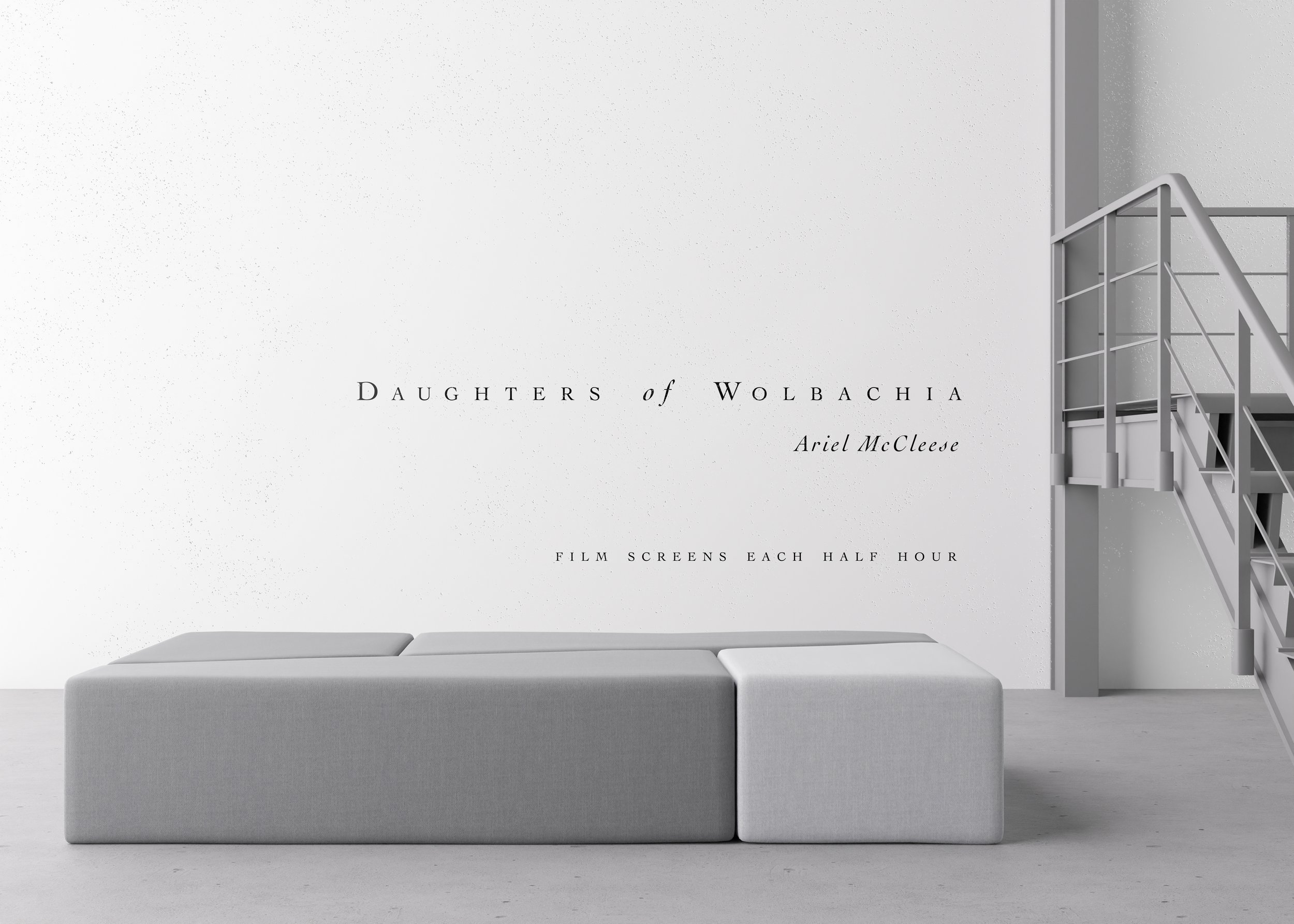
Whatever else we can say about the “white cube”, it’s nice to have a great big wall for your type. I’m glad I got to put this together before the film went on to play festivals (and win awards).